
Advanced Certificate in Data Visualization for Science Communication
Develop future-ready data visualization for science communication competencies. Prepare for opportunities in rapidly evolving markets.
Advanced Certificate in Data Visualization for Science Communication
Programme Overview
The Advanced Certificate in Data Visualization for Science Communication is designed for professionals and students in the fields of science, technology, and communication. This program equips learners with the skills necessary to effectively communicate complex scientific data and concepts through visually compelling and accessible designs. It is ideal for scientists, researchers, and communicators who aim to enhance their ability to translate technical information into engaging narratives that resonate with diverse audiences.
Learners will develop a comprehensive set of skills in data visualization, including the use of advanced tools and software for data manipulation and visualization, as well as the principles of effective visual storytelling. They will learn to create interactive visualizations, infographics, and multimedia presentations that not only communicate data accurately but also engage and educate. The curriculum includes hands-on training in statistical analysis, graphic design, and digital media production, ensuring that students can apply these skills in real-world settings.
The program has a significant impact on career trajectories, preparing graduates to lead in science communication initiatives that require sophisticated data visualization techniques. Graduates can pursue careers in scientific publishing, educational technology, media production, and public policy, where they can leverage their skills to enhance public understanding and engagement with scientific research. Additionally, the program’s emphasis on interdisciplinary collaboration and critical thinking equips learners with the ability to tackle complex communication challenges in a variety of sectors.
What You'll Learn
Embark on a transformative journey with our Advanced Certificate in Data Visualization for Science Communication. Designed for scientists, researchers, and professionals aiming to enhance their ability to convey complex scientific data effectively, this program equips you with the skills to create compelling, accessible visual narratives. You will explore key topics including data analysis, visualization techniques, and the psychology of data interpretation. Through hands-on projects, you'll learn to design infographics, interactive dashboards, and multimedia presentations that engage diverse audiences, from academic peers to the general public.
Our program emphasizes practical application, enabling you to apply your skills in real-world scenarios. Whether sharing research findings at conferences, creating educational materials, or informing policy decisions, you'll be well-prepared to communicate scientific insights visually. Graduates often transition into roles such as science communicators, data analysts, or digital media producers, leveraging their expertise to bridge the gap between complex data and public understanding.
Join us to revolutionize how scientific information is shared and understood, making a meaningful impact through impactful visual storytelling.
Programme Highlights
Industry-Aligned Curriculum
Developed with industry leaders to ensure practical, job-ready skills valued by employers worldwide.
Expert Faculty
Learn from experienced professionals with real-world expertise in your chosen field.
Flexible Learning
Study at your own pace, from anywhere in the world, with our flexible online platform.
Industry Focus
Practical, real-world knowledge designed to meet the demands of today's competitive job market.
Latest Curriculum
Stay ahead with constantly updated content reflecting the latest industry trends and best practices.
Career Advancement
Unlock new opportunities with a globally recognized qualification respected by employers.
Topics Covered
- Foundational Concepts: Covers the core principles and key terminology.
- Data Collection & Management: Discusses effective strategies for gathering and preparing data.
- Statistical Foundations: Introduces essential statistical methods for data analysis.
- Visualization Tools & Software: Reviews popular tools and software for creating visualizations.
- Communication Strategies: Focuses on effective communication of data through visual means.
- Case Studies: Examines real-world examples of successful data visualization in science communication.
Key Facts
Audience: Science communicators, data analysts
Prerequisites: Basic statistics, intermediate Excel
Outcomes: Master data visualization tools, create effective visual stories
Why This Course
Enhanced Data Interpretation Skills: The Advanced Certificate in Data Visualization for Science Communication equips professionals with robust skills in interpreting complex data. This is crucial for scientists and communicators who need to distill intricate findings into understandable insights. For instance, a climate scientist can effectively communicate temperature trends over decades using intuitive visualizations, making the data accessible to policymakers and the public.
Improved Communication Competence: This certification helps professionals develop a deeper understanding of how to communicate scientific data to diverse audiences. Through hands-on projects and case studies, learners can refine their ability to craft compelling narratives around data, ensuring that information resonates with a wide range of stakeholders. This skill is particularly valuable for researchers seeking to influence public opinion or secure funding.
Professional Networking Opportunities: Participating in a specialized program like this often opens doors to a network of professionals in science communication and data visualization. These connections can lead to collaborative projects, mentorship, and career advancement opportunities. For example, a participant might collaborate with a renowned data analyst to co-author a white paper, enhancing their professional profile and expertise.
Career Advancement and Diversification: The demand for skilled data visualizers in the scientific community is growing. Acquiring this certificate can position professionals as leaders in their field, capable of handling complex data visualization tasks. This specialization can lead to higher job satisfaction and potentially higher salaries. Moreover, it diversifies career paths, enabling professionals to transition into roles that focus on data storytelling and visualization, which
Language
- EnglishENGLISH
- हिन्दीHINDI
- EspañolSPANISH
- FrançaisFRENCH
- DeutschGERMAN
- ItalianoITALIAN
- PortuguêsPORTUGUESE
- РусскийRUSSIAN
- 中文MANDARIN
- 日本語JAPANESE
- 한국어KOREAN
- العربيةARABIC
Programme Title
Advanced Certificate in Data Visualization for Science Communication
Course Brochure
Download our comprehensive course brochure with all details
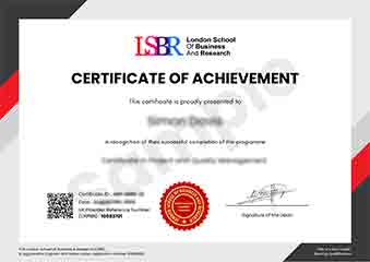
Sample Certificate
Preview the certificate you'll receive upon successful completion of this program.
Pay as an Employer
Request an invoice for your company to pay for this course. Perfect for corporate training and professional development.
What People Say About Us
Hear from our students about their experience with the Advanced Certificate in Data Visualization for Science Communication at CourseBreak.
Charlotte Williams
United Kingdom"The course content is incredibly rich and detailed, providing a solid foundation in advanced data visualization techniques that are essential for effective science communication. Gaining hands-on experience with these tools has significantly enhanced my ability to present complex scientific data in a clear and engaging manner, which I believe will greatly benefit my career in scientific research and outreach."
Sophie Brown
United Kingdom"This course has been instrumental in enhancing my ability to communicate complex scientific data effectively, making my visualizations not only more compelling but also more accessible to a broader audience. It has significantly boosted my career by equipping me with the latest tools and techniques that are highly valued in the industry."
Sophie Brown
United Kingdom"The course structure is well-organized, providing a comprehensive overview of data visualization techniques that are directly applicable to enhancing science communication. It has significantly boosted my ability to create effective visual representations that can engage and inform a diverse audience."