
Advanced Certificate in Optimizing Mobile Study Materials for Different Screen Sizes
Earn an Advanced Certificate in tailoring mobile study materials for optimal display across various screen sizes, enhancing user experience and accessibility.
Advanced Certificate in Optimizing Mobile Study Materials for Different Screen Sizes
Programme Overview
The Advanced Certificate in Optimizing Mobile Study Materials for Different Screen Sizes is a comprehensive programme designed for educators, instructional designers, and professionals in the e-learning and digital content creation industries. This programme equips learners with the advanced skills necessary to develop and optimize educational content specifically tailored for various mobile devices and screen sizes, ensuring that study materials are accessible, engaging, and effective across platforms. The curriculum covers topics such as responsive web design, mobile-first design principles, accessibility standards, and interactive content creation, providing a robust foundation in the latest technologies and methodologies.
Learners will develop key skills in designing user-friendly interfaces, creating adaptive layouts, integrating multimedia elements, and optimizing content for performance on diverse devices. They will also gain proficiency in using tools and frameworks essential for mobile content development, such as HTML5, CSS3, and JavaScript. Through hands-on projects and real-world case studies, participants will refine their ability to analyze user needs, implement design solutions, and conduct user testing to ensure that their mobile study materials meet the highest standards of quality and usability.
This programme significantly impacts careers by opening up new opportunities for professionals in the field of e-learning and digital content creation. Graduates will be well-prepared to enhance the accessibility and effectiveness of educational materials for a mobile-first world, aiding in the development of more engaging and inclusive learning experiences. The skills acquired will be highly valued in the market, providing a clear edge in the competitive landscape of digital education and technology.
What You'll Learn
The Advanced Certificate in Optimizing Mobile Study Materials for Different Screen Sizes is a cutting-edge program designed to empower educators, content creators, and digital professionals with the skills to develop and optimize educational materials for a wide range of mobile devices. This program is invaluable for those aiming to enhance user engagement, accessibility, and learning outcomes through mobile-friendly content.
Key topics include responsive design principles, mobile-first approaches, interactive content creation, and user experience optimization. Participants will learn to adapt text, images, and multimedia for various screen sizes and resolutions, ensuring that educational materials are not only visually appealing but also function seamlessly on smartphones, tablets, and other devices.
Graduates will be able to apply these skills to create dynamic, user-centered learning experiences that cater to diverse student demographics. They can transform traditional educational content into engaging, interactive mobile applications and web-based materials that promote effective learning across different platforms.
This program opens doors to a variety of career opportunities in educational technology, digital content development, and user experience design. Graduates are well-prepared to work in educational institutions, tech startups, and large corporations, contributing to the design and implementation of innovative, mobile-friendly educational solutions. By mastering the art of mobile content optimization, professionals can significantly enhance the accessibility and effectiveness of educational materials, making a meaningful impact on learning outcomes.
Programme Highlights
Industry-Aligned Curriculum
Developed with industry leaders to ensure practical, job-ready skills valued by employers worldwide.
Expert Faculty
Learn from experienced professionals with real-world expertise in your chosen field.
Flexible Learning
Study at your own pace, from anywhere in the world, with our flexible online platform.
Industry Focus
Practical, real-world knowledge designed to meet the demands of today's competitive job market.
Latest Curriculum
Stay ahead with constantly updated content reflecting the latest industry trends and best practices.
Career Advancement
Unlock new opportunities with a globally recognized qualification respected by employers.
Topics Covered
- Screen Size Fundamentals: Covers the core principles and key terminology related to various screen sizes.
- Responsive Design Techniques: Explores practical techniques used in real-world settings to create responsive designs.
- Adaptive Layouts: Discusses methods for designing layouts that adapt to different screen sizes.
- Image Optimization: Focuses on techniques for optimizing images to ensure they load quickly on mobile devices.
- Text and Font Management: Covers best practices for managing text and fonts across different screen sizes.
- Testing and Debugging: Provides strategies for testing and debugging mobile study materials to ensure they function correctly on various devices.
Key Facts
Audience: Educators, content creators, technologists
Prerequisites: Basic understanding of mobile devices
Outcomes: Proficient in responsive design, enhanced user experience
Why This Course
Expertise in Mobile Optimization: Acquiring the 'Advanced Certificate in Optimizing Mobile Study Materials for Different Screen Sizes' equips professionals with specialized skills in designing adaptable content that performs well across various devices. This enhances the user experience, pivotal for educators and content providers aiming to reach a broader audience.
Enhanced Career Opportunities: As digital platforms continue to dominate educational delivery, possessing this certificate can open doors to higher-paying roles or opportunities in tech-driven educational institutions. Employers increasingly value candidates who can develop and maintain mobile-friendly content, ensuring materials are accessible on a range of devices.
Competitive Edge in Skill Set: With the certificate, professionals can demonstrate a sophisticated understanding of responsive design principles and mobile usability standards. This not only improves their current job performance but also prepares them for emerging trends in mobile learning, setting them apart from peers who may lack such specialized knowledge.
Programme Title
Advanced Certificate in Optimizing Mobile Study Materials for Different Screen Sizes
Course Brochure
Download our comprehensive course brochure with all details
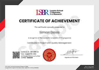
Sample Certificate
Preview the certificate you'll receive upon successful completion of this program.
Pay as an Employer
Request an invoice for your company to pay for this course. Perfect for corporate training and professional development.
What People Say About Us
Hear from our students about their experience with the Advanced Certificate in Optimizing Mobile Study Materials for Different Screen Sizes at CourseBreak.
Oliver Davies
United Kingdom"The course content was incredibly detailed and well-organized, providing a solid foundation in optimizing mobile study materials for various screen sizes. I gained practical skills that have already enhanced my ability to create more user-friendly and accessible educational content, which is invaluable for my career in e-learning."
Zoe Williams
Australia"This course has been incredibly valuable in making my mobile study materials more accessible and engaging. It has not only enhanced my technical skills but also opened up new opportunities in the tech industry, particularly in app development and educational technology."
Fatimah Ibrahim
Malaysia"The course structure was well-organized, providing a clear progression from basic principles to advanced techniques in optimizing mobile study materials. The comprehensive content offered valuable insights into real-world applications, significantly enhancing my ability to create responsive designs for various screen sizes."